by Lyra Kilston
GRITTY OR PASTORAL, MOSTLY UNGLAMOROUS, PICO BOULEVARD EMBODIES THE OFF-SCREEN REALISM AND ECLECTICISM OF L.A.
Many cities can be defined by the varying character of their neighborhoods — for example Le Marais in Paris, New York’s Lower East Side, or Jordaan in Amsterdam. But in Los Angeles, metropolis of automobiles, it makes more sense to consider character not by region, but by thoroughfare, from the vantage point of your car. In fact, when architectural critic Reyner Banham moved to Los Angeles from London in 1968, he famously wrote that, “like earlier English intellectuals who taught themselves Italian in order to read Dante in the original, I learned to drive in order to learn Los Angeles in the original.” So reading Los Angeles “in the original” requires a full tank of gas.
This sprawling city, framed by the smooth Pacifi c on one side and a crescent of hills on the other, doesn’t boast a neat grid of streets. And the major boulevards, which stretch for miles and miles (the longest snakes along for 42), possess no consistency of disposition; more commonly they meander through a range of populations and architectural styles so diverse as to be dizzying. Pico Boulevard, a bold street stretching from downtown to Santa Monica beach, is a perfect case study. Gritty or pastoral, mostly unglamorous, and not for tourists, Pico Boulevard embodies the off-screen realism and eclecticism of Los Angeles.
Named after Governor Po Pico, the last governor who served under Mexican rule, Pico Boulevard is host to concentrations of many ethnicities, including Japanese, Korean, Persian, Jewish, African-American, Nicaraguan, Salvadoran, and Mexican. Our Pulitzer-winning food critic, Jonathan Gold, once spent a year trying to eat at every restaurant on Pico, starting with fried yucca at a Salvadoran place downtown, and ending with chili fries at the beach. Pico Boulevard begins as a colorful and congested road near downtown’s factories and wholesale districts. Hand-painted signs in primary colors advertise products at Latino carnicerias and panaderias, and the bright blue of the Salvadoran flag often adorns storefronts and gates. Immigration offices, money transfer centers, produce shops and restaurants line the streets, frequently spilling salsa music onto the sidewalk. Soon, the street widens and transitions to visual deserts of bland auto body shops, punctuated with Korean signage. A few miles later, Hebrew and Arabic lettering enter the picture, posted above men in black smoking hookahs on the sidewalk.
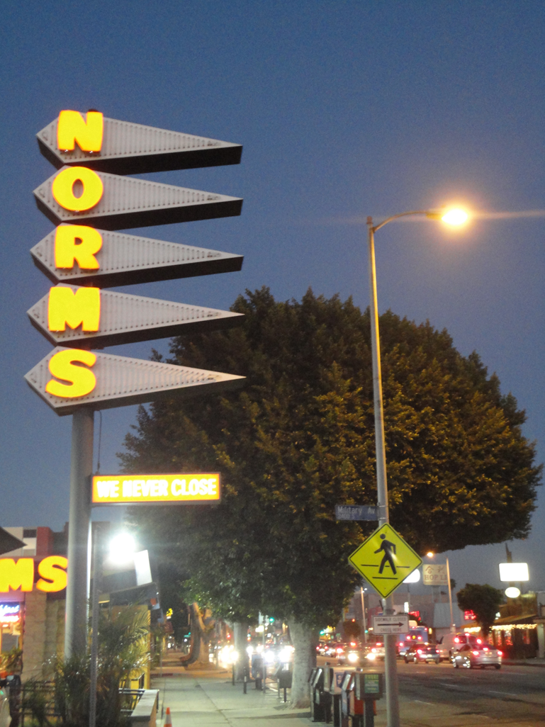
Signage is an art form that rose to great heights in Los Angeles, to capture the attention of swift drivers. (In fact, the first neon sign in the United States was installed in Los Angeles in 1923.) Roofs were also often whimsically designed (with dramatic spikes or arcs, for example) for the same goal. This style of eclectic, eye-catching exteriors, known as “Googie” architecture, peaked in the late 1950s-early 1960s. A prime example is Norms diner on Pico, whose “sawtooth” sign lights up to beckon hungry drivers. Designed by architectural team Armet & Davis, who went on to canonize the Googie aesthetic in hundreds of restaurants, the iconic sawtooth sign grew from a simple sketch on a napkin.
A few more blocks west, and the streetlamps take on a peculiar organic look designed by artist Sheila Klein, who calls them Leaf-lights, signaling the neighborhood of Santa Monica. On this stretch of Pico, gilded by the coastal light, is the Eames Office, with the iconic molded plywood leg splints, chairs, clocks, posters, lamps, and tables visible through wide glass windows. Los Angeles is full of these moments of incongruous juxtapositions: huge boxy chain stores next to fragments of faded history, small stretches of blandness bookended by burger shacks. After hours of travelling and taking in all the visual and textual information, it felt a bit like I’d been surfing the Internet.
Driving here can be a shallow ride of fast data, where all information is equal, from the sunbaked parking lot littered with plastic bags to the tiny shop selling kosher ice cream. Decades ago, novelist Christopher Isherwood described the hypnotic effect of moving through Los Angeles, the blur of billboards and news radio causing him to warn “Wake Up!”; but the streets were designed for such a vast sea of details, calling to us in multiple languages, from multiple eras, as we drive on through.


